

Introduction: Responsive Landing Page
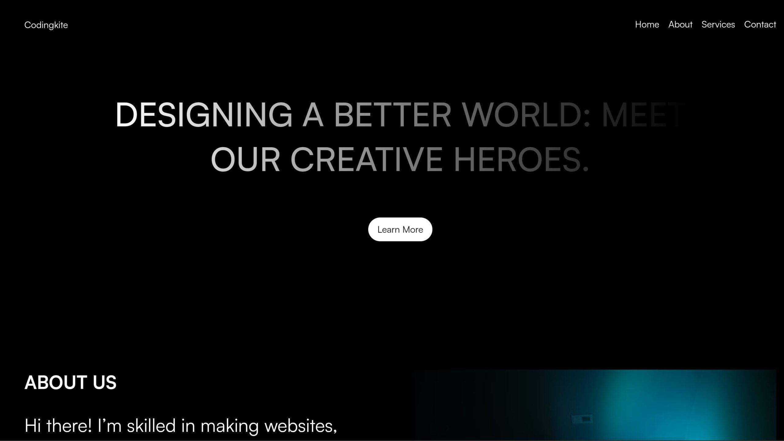
Embarking on the journey to create a Responsive Landing Page using HTML, CSS, and JavaScript is a thrilling opportunity for coding enthusiasts. This tutorial provides a clear, step-by-step guide to building a dynamic and responsive landing page, offering valuable insights into responsive web design. Whether you’re a beginner or an experienced developer, mastering these core technologies is crucial in today’s digital landscape.
This exploration of responsive Landing Page development unfolds with clarity, empowering you to craft an interactive and visually compelling online presence. The tutorial focuses on essential concepts, ensuring a comprehensive understanding of how HTML, CSS, and JavaScript collaborate to create a versatile and engaging and responsive landing page. Let’s dive into this coding expedition, where your proficiency will shine through in the creation of a captivating and responsive landing page.
Join Our Telegram Channel to Download the Project Source Code: Click Here
Steps to Set Up: Responsive Landing Page
Please follow this Step-by-Step Guide to Create and Setup the Responsive Landing Page using HTML, CSS and JavaScript —
Create Project Files: Begin by create a project folder, Name it as you prefer. Create these 3 files inside the folder: an index.html file for the structure, a style.css file for styling, and a script.js file for interactivity. This step lays the foundation for your responsive landing page.
Step 1: HTML Structure
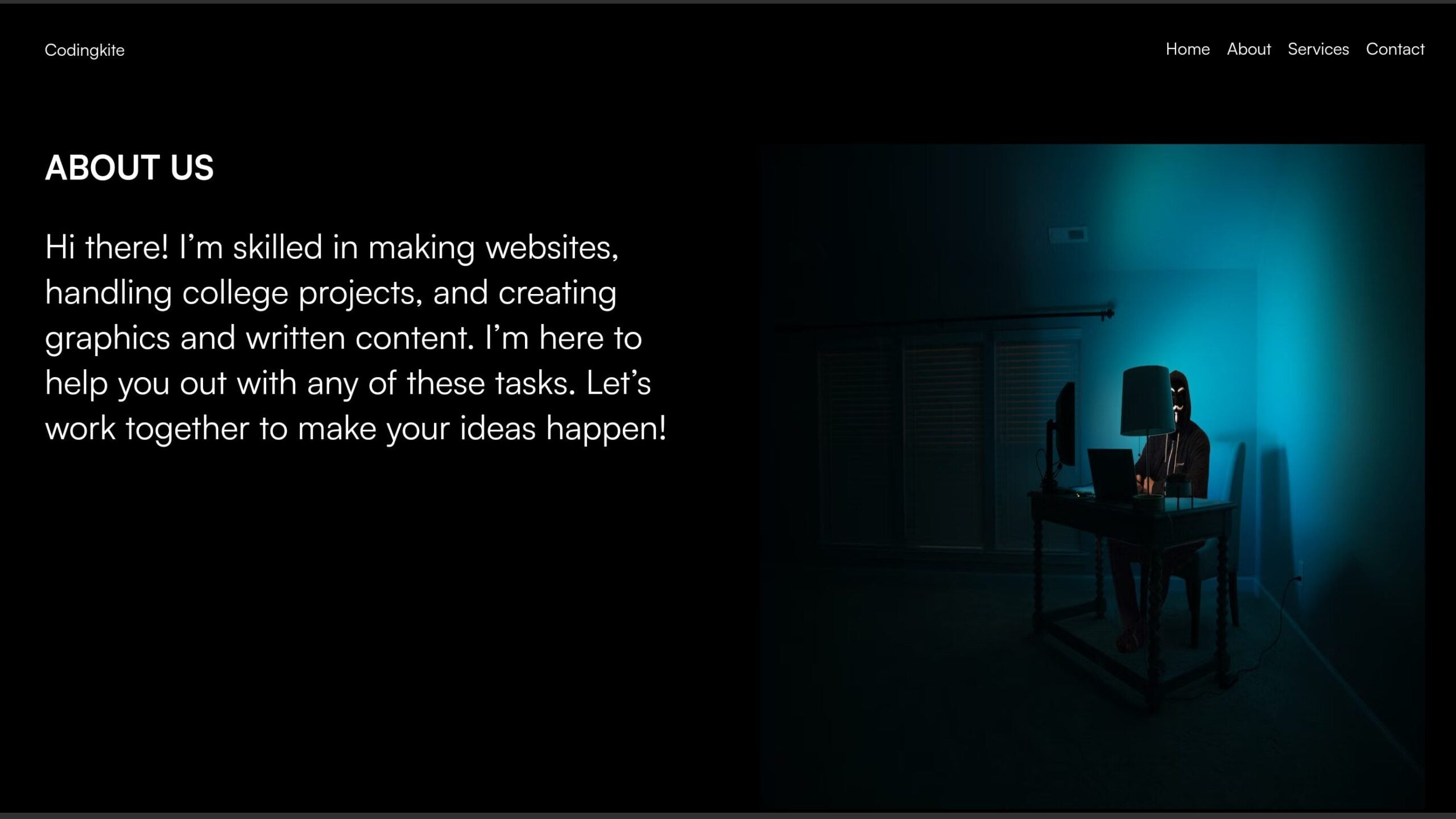
In the index.html file, paste the provided HTML code for the basic structure of your responsive landing page. Employ HTML elements to define sections such as navigation, home section, about section, and more. Utilize semantic tags for clarity and accessibility, enhancing the page’s SEO.
<!DOCTYPE html>
<html lang="en">

<head>
    <meta charset="UTF-8">
    <meta name="viewport" content="width=device-width, initial-scale=1.0">
    <link href="https://api.fontshare.com/v2/css?f[]=satoshi@700,500,400&display=swap" rel="stylesheet">
    <title>Simple landing page</title>
</head>

<body>
    <div class="nav-parent">
        <div class="nav-wrapper">
            <div class="branding">
                <a href="#">Codingkite</a>
            </div>

            <ul>
                <li><a href="#">Home</a></li>
                <li><a href="#">About</a></li>
                <li><a href="#">Services</a></li>
                <li><a href="#">Contact</a></li>
            </ul>

            <a class="burger" onclick="burgerButton()">
                <div class="bar"></div>
                <div class="bar"></div>
            </a>
        </div>
    </div>

    <div class="burger-links">
        <ul>
            <li><a href="#">Home</a></li>
            <li><a href="#">About</a></li>
            <li><a href="#">Services</a></li>
            <li><a href="#">Contact</a></li>
        </ul>
    </div>

    <div class="home-section">
        <div class="home-hero">
        </div>

        <h1>
            Designing a Better World: Meet Our Creative Heroes.
        </h1>

        <a href="#">Learn More</a>
    </div>

    <div class="about-section">
        <div class="about-description">
            <h1>ABOUT US</h1>
            <p>
                Hi there! I’m skilled in making websites, handling college projects, and creating graphics and written
                content. I’m here to help you out with any of these tasks. Let’s work together to make your ideas
                happen!
        </div>

        <div class="about-image">
            <img src="https://images.unsplash.com/photo-1562813733-b31f71025d54?q=80&w=1469&auto=format&fit=crop&ixlib=rb-4.0.3&ixid=M3wxMjA3fDB8MHxwaG90by1wYWdlfHx8fGVufDB8fHx8fA%3D%3D"
                alt="img">
        </div>
    </div>
</body>
</html>
Step 2: Style with CSS
Insert the below CSS code into your style.css file to enhance the visual appeal of your responsive landing page. The provided CSS code offers a clean and modern aesthetic, adjusting seamlessly for smaller screens. Tweak the styles to align with your brand or project theme.
        * {
            margin: 0;
            padding: 0;
            box-sizing: border-box;
        }

        :root {
            --main-color: #000;
            --secondary-color: #fff;
            --bg-color: #000;
        }

        body {
            background: var(--bg-color);
            font-family: 'Satoshi', sans-serif;
        }

        a {
            text-decoration: none;
            color: var(--secondary-color);
        }

        ul {
            list-style: none;
        }

        .nav-parent {
            width: 100%;
            position: fixed;
            top: 0;
            z-index: 3;
        }

        .nav-wrapper {
            display: flex;
            justify-content: space-between;
            align-items: center;
            padding: 2rem 4rem;
            mix-blend-mode: difference;
            background: var(--bg-color);
        }

        .nav-wrapper ul {
            display: flex;
            justify-content: center;
            align-items: center;
            gap: 1rem;
        }

        .nav-wrapper ul li a::after {
            content: '';
            display: flex;
            width: 0%;
            height: 2px;
            background: var(--secondary-color);
            transition: all .3s ease;
        }

        .nav-wrapper ul li a:hover::after {
            width: 100%;
        }

        .burger {
            display: none;
            justify-content: space-between;
            align-items: center;
            flex-direction: column;
            width: 50px;
            height: 10px;
        }

        .burger.active .bar:nth-child(1) {
            transform: rotate(45deg) translateY(6px);
        }

        .burger.active .bar:nth-child(2) {
            transform: rotate(-45deg) translateY(-5px);
            ;
        }

        .burger .bar {
            width: 100%;
            height: 2px;
            background: var(--secondary-color);
            transition: all .3s ease;
        }

        .burger-links {
            display: none;
            justify-content: center;
            align-items: center;
            font-size: 2rem;
            width: 100%;
            height: 100vh;
            position: fixed;
            z-index: 2;
            background: var(--bg-color);
            top: -100%;
            transition: all .3s ease;
        }

        .burger-links.active {
            top: 0%;
        }

        .home-section {
            display: grid;
            place-items: center;
            position: relative;
            margin-top: 10rem;
        }

        .home-section h1 {
            font-size: clamp(3rem, 4vw, 6rem);
            color: var(--secondary-color);
            width: 70%;
            font-weight: 500;
            text-align: center;
            text-transform: uppercase;
            z-index: 1;
            background: linear-gradient(to right,
                    #ffffff,
                    #00000000);
            -webkit-background-clip: text;
            -webkit-text-fill-color: transparent;

        }

        .home-section a {
            background: var(--secondary-color);
            color: var(--main-color);
            padding: 10px 1rem;
            margin-top: 4rem;
            border-radius: 50px;
        }

        .home-hero {
            position: absolute;
        }

        .home-hero img {
            aspect-ratio: 1/1;
            object-fit: cover;
            width: clamp(300px, 40vw, 500px);
            /*   filter: saturate(0%); */
        }

        .about-section {
            display: grid;
            grid-template-columns: 1fr 1fr;
            gap: 3rem;
            padding: 4rem;
            margin-top: 10rem;
        }

        .about-description h1,
        .about-description p {
            color: var(--secondary-color);
        }

        .about-description p {
            margin-top: 2rem;
            font-size: 2rem;
        }

        .about-image {
            display: flex;
            justify-content: center;
            align-items: center;
        }

        .about-image img {
            aspect-ratio: 1/1;
            width: 100%;
        }

        @media (max-width:768px) {
            body.active {
                overflow: hidden;
            }

            .nav-wrapper {
                padding: 2rem;
            }

            .nav-wrapper ul {
                display: none;
            }

            .burger {
                display: flex;
            }

            .burger-links {
                display: flex;
            }

            .about-section {
                grid-template-columns: 1fr;
            }

            .about-description {
                text-align: center;
            }

            .about-description p {
                font-size: revert;
            }
        }
Step 3: Implement JavaScript Interactivity
Next, paste the provided JavaScript code into your script.js file to enhance user experience with interactive elements. The Javascript code includes a burger menu functionality, providing a smooth navigation experience on smaller screens. This script to fit additional features or customizations you desire for your responsive landing page.
        const burgerLinks = document.querySelector('.burger-links');
        const burger = document.querySelector('.burger');
        const body = document.querySelector('body');

        burgerButton = function () {
            burgerLinks.classList.toggle('active');
            burger.classList.toggle('active');
            body.classList.toggle('active');
        }
By following these three steps, you’ll create a visually striking and responsive landing page. Remember to regularly preview your work to ensure a seamless user experience across devices.
Conclusion & Final Words:
Creating a Responsive Landing Page using HTML, CSS, and JavaScript not only refines your coding skills but also ensures a user-friendly and visually appealing online presence. The seamless adaptation to various screen sizes is crucial in today’s diverse device landscape.
Embrace this tutorial as an opportunity to explore, experiment, and enjoy the process of building a project from the ground up. Your responsive landing page will not only showcase your coding prowess but also serve as a testament to your ability to create functional and engaging web experiences.
Join Our Telegram Channel to Download the Project Source Code: Click Here
For your convenience, the total source code of this “Responsive Landing Page” project instructional practice is accessible for download by clicking the Download Code button.
Note: Keep in mind that the way to dominate coding is practice. To enhance your skills in JavaScript, HTML & CSS, we recommend recreating other useful website elements such as Custom Button, Reviews Card, Contact Page, Navigation, Login Forms, etc.
More Categories:
Blog • Cards • Fun Project • Game • Hamburger Menu • Login / Signup • Navbar • Testimony / Reviews • To-Do List


