Introduction:
Embarking on the journey of creating a Simplest Custom Select Box using HTML, CSS, and JavaScript is a fantastic way to enhance your coding prowess. This hands-on project will guide you through the process of building an interactive select box, incorporating essential concepts like DOM manipulation and event handling.
Dive into the world of web development by crafting a select box that not only serves a practical purpose but also elevates your understanding of front-end design. By the end of this article, you’ll have a functional custom select box ready to integrate into your projects.
Steps to Create Simplest Custom Select Box using JavaScript:
Please follow this Step-by-Step Guide to Create and Setup the Simplest Custom Select Box using JavaScript —
- Begin by creating a new folder for your project.
- Inside the folder, create three files:
index.html,style.css, andscript.js.
HTML Structure:
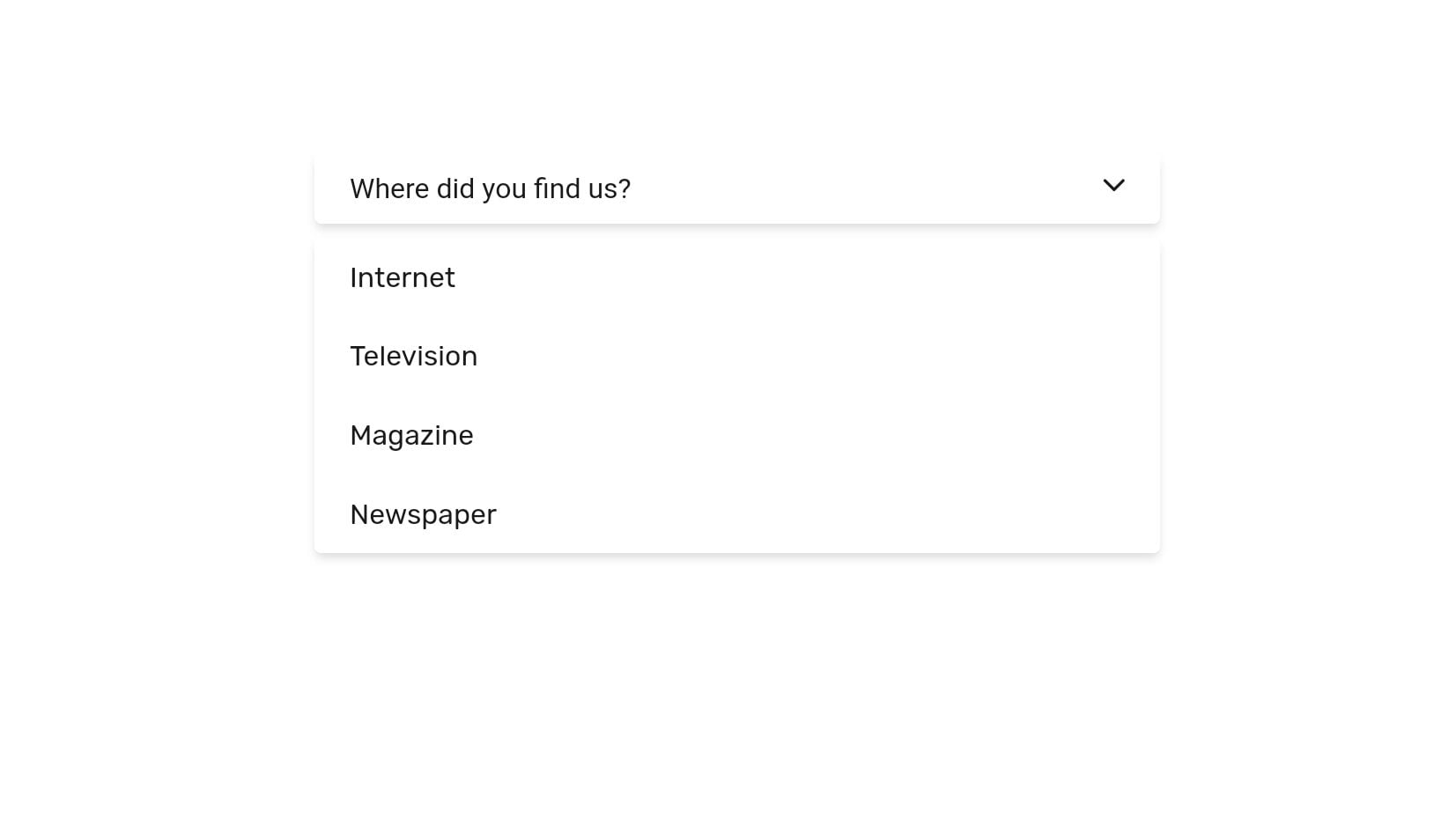
Open index.html and add the provided HTML code. This sets up the basic structure of your custom select box.
<main class="main">
	<section class="section wrapper-section">
		<div class="container wrapper-column">
			<form name="survey" class="form">
				<div class="form-control">
					<button type="button" class="select-box">
						<span class="select-label">Where did you find us?</span>
						<span><i class="ion-ios-arrow-down select-arrow"></i></span>
					</button>
					<div class="select-detail" id="select-detail">
						<input type="radio" name="media" id="internet" class="select-input" value="internet">
						<label for="internet" class="select-value">Internet</label>
						<input type="radio" name="media" id="television" class="select-input" value="television">
						<label for="television" class="select-value">Television</label>
						<input type="radio" name="media" id="magazine" class="select-input" value="magazine">
						<label for="magazine" class="select-value">Magazine</label>
						<input type="radio" name="media" id="newspaper" class="select-input" value="newspaper">
						<label for="newspaper" class="select-value">Newspaper</label>
					</div>
				</div>
			</form>
		</div>
	</section>
</main>
Enhance Styling with CSS:
In style.css, apply styles to enhance the visual appeal of your select box. Feel free to customize the appearance according to your project’s design.
@import url("https://fonts.googleapis.com/css2?family=Rubik:wght@400;500;600;700&display=swap");

:root {
	--color-black: hsl(0, 0%, 10%);
	--color-darks: hsl(0, 0%, 25%);
	--color-greys: hsl(0, 0%, 60%);
	--color-light: hsl(0, 0%, 94%);
	--color-white: hsl(0, 0%, 100%);

	--shadow-sm: 0 1px 3px 0 rgba(0, 0, 0, 0.1), 0 1px 2px 0 rgba(0, 0, 0, 0.06);
	--shadow-md: 0 4px 6px -1px rgba(0, 0, 0, 0.1),
		0 2px 4px -1px rgba(0, 0, 0, 0.06);
	--shadow-lg: 0 10px 15px -3px rgba(0, 0, 0, 0.1),
		0 4px 6px -2px rgba(0, 0, 0, 0.05);
}

*,
*::before,
*::after {
	padding: 0;
	margin: 0;
	box-sizing: border-box;
	list-style: none;
	list-style-type: none;
	text-decoration: none;
	-webkit-font-smoothing: antialiased;
	-moz-osx-font-smoothing: grayscale;
	text-rendering: optimizeLegibility;
}

html {
	font-size: 100%;
	box-sizing: inherit;
	scroll-behavior: smooth;
	height: -webkit-fill-available;
}

body {
	font-family: "Rubik", sans-serif;
	font-size: 1rem;
	font-weight: 400;
	line-height: 1.5;
	height: -webkit-fill-available;
	color: var(--color-black);
	background-color: var(--color-white);
}

a,
button {
	cursor: pointer;
	border: none;
	outline: none;
	background: none;
	text-transform: unset;
	text-decoration: none;
}

img,
video {
	display: block;
	max-width: 100%;
	height: auto;
	object-fit: cover;
}

img {
	image-rendering: -webkit-optimize-contrast;
	image-rendering: -moz-crisp-edges;
	image-rendering: crisp-edges;
}

// Elements
.section {
	margin: 0 auto;
	padding: 6rem 0 1rem;
}

.container {
	max-width: 75rem;
	height: auto;
	margin: 0 auto;
	padding-inline: 2rem;
}

.centered {
	margin-bottom: 1rem;
	text-align: center;
	vertical-align: middle;
}

.form {
	max-width: 30rem;
	height: auto;
	margin: 0 auto;

	&-control {
		position: relative;
		margin-bottom: 1rem;
	}

	&-label {
		font-family: inherit;
		font-size: 0.95rem;
		font-weight: 400;
		line-height: 1.5;
		color: var(--color-black);
		text-transform: capitalize;
	}

	&-input {
		font-family: inherit;
		font-size: 1rem;
		font-weight: 400;
		line-height: inherit;
		width: 100%;
		height: auto;
		padding: 0.65rem 1.25rem;
		border: none;
		outline: none;
		border-radius: 0.25rem;
		color: var(--color-black);
		background-clip: padding-box;
		background-color: var(--color-white);
		box-shadow: var(--shadow-md);
	}
}

.select {
	&-box {
		position: relative;
		width: 100%;
		height: auto;
		padding: 0.65rem 1.25rem;
		border: none;
		user-select: none;
		text-align: start;
		border-radius: 0.25rem;
		color: var(--color-black);
		background-clip: padding-box;
		background-color: var(--color-white);
		box-shadow: var(--shadow-md);
	}

	&-label {
		display: block;
		font-family: inherit;
		font-size: 1rem;
		font-weight: 400;
		line-height: inherit;

		color: var(--color-black);
	}

	&-arrow {
		position: absolute;
		top: 0.5rem;
		right: 1.25rem;
		font-size: 1.15rem;
	}

	&-detail {
		position: absolute;
		display: none;
		top: 3rem;
		left: 0;
		width: 100%;
		height: auto;
		overflow: hidden;
		visibility: hidden;
		border-radius: 0.25rem;
		color: var(--color-black);
		background-color: var(--color-white);
		box-shadow: var(--shadow-md);
		transition: all 0.3s ease-in-out;

		&.is-active {
			display: block;
			visibility: visible;
		}
	}

	&-input {
		display: none;
		visibility: hidden;
	}

	&-value {
		display: block;
		font-family: inherit;
		font-size: 1rem;
		font-weight: 400;
		line-height: inherit;
		cursor: pointer;
		user-select: none;
		text-transform: capitalize;
		padding: 0.65rem 1.25rem;
		color: var(--color-black);
		background-color: var(--color-white);
		transition: all 0.3s ease-in-out;

		&:hover {
			background-color: var(--color-light);
		}
	}
}
Add Interactive Functionality with JavaScript:
Open script.js and paste the JavaScript code. This script manages the show/hide functionality of the select box and updates the label based on user selections.
const selectBoxed = document.querySelector(".select-box");
const selectLabel = document.querySelector(".select-label");
const selectDetail = document.querySelector(".select-detail");
const selectInput = document.querySelectorAll(".select-input");

// Show and Hide the Select Boxed
selectBoxed.addEventListener("click", (e) => {
	e.preventDefault();
	selectDetail.classList.toggle("is-active");
});

// Selected the Radio Input Value
selectInput.forEach((input) => {
	input.addEventListener("click", (item) => {
		const selectValue = document.querySelector(`label[for="${item.target.id}"]`)
			.innerText;
		selectLabel.innerText = selectValue;
		selectDetail.classList.toggle("is-active");
	});
});
Conclusion:
In just a few simple steps, you’ve created a Simplest Custom Select Box using JavaScript, HTML, and CSS. This project not only provides hands-on experience but also reinforces your understanding of fundamental web development concepts.
Remember, coding is an exploration. Experiment with the provided code, tweak styles, and adapt the functionality to suit your project requirements.
For your convenience, the total source code of this “Text Shadow Generator using JavaScript” project instructional practice is accessible for download by clicking the Download Code button.
Note: Keep in mind that the way to dominate coding is practice. To enhance your skills in JavaScript, HTML & CSS, we recommend recreating other useful website elements such as Custom Button, Reviews Card, Contact Page, Navigation, Login Forms, etc.
Code by – Syahrizal