Table of Contents
Introduction: Responsive PRICING SECTION
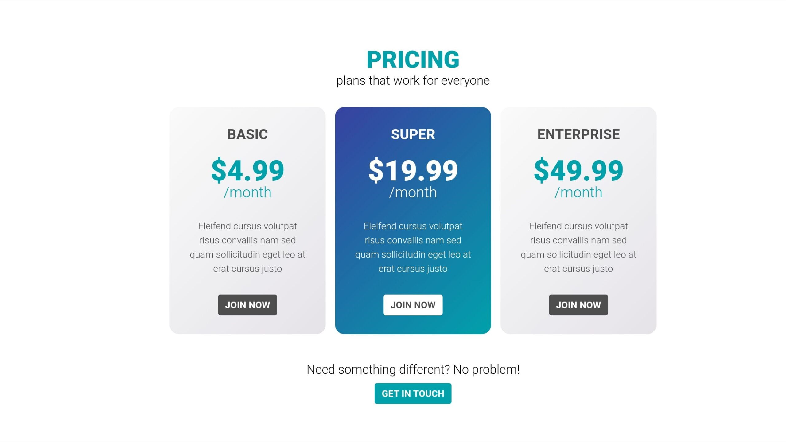
Greetings, coding enthusiasts! Today, we embark on an exciting journey into web development as we explore the creation of a responsive PRICING section using HTML and CSS. A pricing section is a pivotal element for many websites, offering users a transparent overview of available plans. In this comprehensive tutorial, we’ll guide you through each step to seamlessly set up an engaging and responsive pricing display for your projects. Whether you’re a novice or an experienced developer, this tutorial will equip you with valuable insights into crafting visually appealing and user-friendly pricing components. Let’s dive in!
Steps to Set Up the Project:
For creating Responsive PRICING SECTION, Begin by creating a new folder for your project. Name it whatever suits your preference. Inside this folder, include the given HTML code in an index.html file and the accompanying styles in a style.css file. Additionally, make sure to include the necessary font link in the head section of your HTML file.
HTML Markup:
Open the index.html file and start building the structure. Use the provided HTML code as a foundation. This includes heading tags, pricing plans with titles, prices, descriptions, and call-to-action buttons. Ensure that the class names align with the CSS styles for proper styling.
<!DOCTYPE html>
<html lang="en">

<head>
    <meta charset="UTF-8">
    <meta name="viewport" content="width=device-width, initial-scale=1.0">
    <title>PRICING section </title>
</head>

<body>

    <head>
        <link href="https://fonts.googleapis.com/css2?family=Roboto:wght@300;700;900&display=swap" rel="stylesheet">
    </head>

    <body>
        <h1 class="text-accent">pricing</h1>
        <p class="fs-500">plans that work for everyone</p>
        <div class="plans flow-content">
            <div class="plan plan--light">
                <h2 class="plan-title">basic</h2>
                <p class="plan-price">$4.99<span>/month</span></p>
                <p class="plan-description">
                    Eleifend cursus volutpat risus convallis nam sed
                    quam sollicitudin eget leo at erat cursus justo
                </p>
                <a href="#" class="btn">Join Now</a>
            </div>

            <div class="plan plan--accent">
                <h2 class="plan-title">super</h2>
                <p class="plan-price">$19.99<span>/month</span></p>
                <p class="plan-description">
                    Eleifend cursus volutpat risus convallis nam sed
                    quam sollicitudin eget leo at erat cursus justo
                </p>
                <a href="#" class="btn">Join Now</a>
            </div>

            <div class="plan plan--light">
                <h2 class="plan-title">Enterprise</h2>
                <p class="plan-price">$49.99<span>/month</span></p>
                <p class="plan-description">
                    Eleifend cursus volutpat risus convallis nam sed
                    quam sollicitudin eget leo at erat cursus justo
                </p>
                <a href="#" class="btn">Join Now</a>
            </div>
        </div>
        <p class="fs-500 mb">Need something different? No problem!</p>
        <a href="#" class="btn btn-mb">Get in touch</a>
    </body>
</body>
</html>
CSS Styling:
Move on to the style.css file to add styling for a visually appealing pricing section. Customize colors, fonts, and backgrounds according to your project’s theme. The given CSS code already includes styles for different plan variations – light and accent. Feel free to tweak these to match your design preferences.
        *,
        *::before,
        *::after {
            box-sizing: border-box;
        }

        body {
            font-family: 'Roboto', sans-serif;
            text-align: center;
        }

        h1 {
            font-size: 2.5rem;
            font-weight: 900;
            text-transform: uppercase;
            margin-top: 2em;
            margin-bottom: 0;
        }

        .text-accent {
            color: #00A1AB;
        }

        .fs-500 {
            font-size: 1.3125rem;
            margin: 0;
        }

        .mb {
            margin-bottom: 0.5em;
        }

        .plans {
            display: flex;
            justify-content: center;
            flex-wrap: wrap;
            margin: 2em 0;
        }

        .plan {
            width: 16.5rem;
            padding: 2em;
            border-radius: 1em;
            margin: 0 0.5em 1em;
        }

        .plan--light {
            color: #4E4E4E;
            background: linear-gradient(-45deg, #E5E3E8, #FAFAFA);
        }

        .plan--light .plan-price {
            color: #00A1AB;
        }

        .plan--light .btn {
            color: #FFF;
            background: #4E4E4E;
        }

        .plan--accent {
            color: #FFF;
            background: linear-gradient(-45deg, #00A1AB, #3741A0);
        }

        .plan--accent .btn {
            color: #4E4E4E;
            background: #FFF;
        }

        .plan-title {
            text-transform: uppercase;
            margin: 0 0 1em;
        }

        .plan-price {
            margin: 0;
            font-size: 3rem;
            line-height: 1;
            font-weight: 900;
        }

        .plan-price span {
            display: block;
            font-size: 1.5625rem;
            font-weight: 300;
        }

        .plan-description {
            margin: 2em 0;
            line-height: 1.5;
        }

        .btn {
            display: inline-block;
            padding: 0.5em 0.75em;
            border-radius: 0.25em;
            text-transform: uppercase;
            text-decoration: none;
            font-weight: 700;
            color: #FFF;
            background: #00A1AB;
            transition: 0.3s;
        }

        .btn:hover {
            opacity: 0.7;
        }

        .btn-mb {
            margin-bottom: 3em;
        }

        .btn--light {
            color: #4E4E4E;
            background: #FFF;
        }

        .btn--dark {
            color: #FFF;
            background: #4E4E4E;
        }
Conclusion:
Congratulations! You’ve successfully set up a responsive PRICING section using HTML and CSS. This project not only enhances your coding skills but also provides a practical example of creating visually appealing and user-friendly components for websites. Don’t hesitate to experiment with the code, add more features, or integrate it into your existing projects. The knowledge gained from this tutorial will undoubtedly contribute to your journey as a web developer.
Now that you’ve completed this project, feel free to explore more advanced features, such as dynamic pricing data or interactive elements. The web development world is vast, and every project you tackle brings you one step closer to mastery. Keep coding, stay curious, and happy developing!
For your convenience, the total source code of this “Responsive PRICING section using HTML” project instructional practice is accessible for download by clicking the Download Code button.
Note: Keep in mind that the way to dominate coding is practice. To enhance your skills in JavaScript, HTML & CSS, we recommend recreating other useful website elements such as Custom Button, Reviews Card, Contact Page, Navigation, Login Forms, etc.


