
Welcome to the comprehensive guide on crafting an enchanting 2024 Image Hover Effect for your website! In this tutorial, we’ll delve into the world of HTML and CSS to create a captivating visual experience that comes to life when users interact with your images. Step-by-step, we’ll guide you through the process, from organizing your project to understanding and implementing the provided code.
Embark on this coding adventure with us as we explore the intricacies of image hover effects. Whether you’re a coding veteran or just starting, this tutorial promises to enhance your skills and add a dynamic flair to your web projects.
Let’s begin the journey of creating the easiest image hover effect using HTML and CSS, unraveling the magic step by step.
Join Our Telegram Channel to Download the Project Source Code: Click Here
Prerequisites:
Before diving into this tutorial, make sure you have a basic understanding of HTML and CSS. You’ll also need a code editor like Visual Studio Code or Sublime Text to seamlessly write and save your code. Now, let’s bring your images to life with the most engaging and easiest Image Hover Effect!
Steps to Create the Easiest Image Hover Effect:
Please follow this Step-by-Step Guide to Create and Setup the Easiest Image Hover Effect using HTML and CSS —
Step 1: Setting Up the Project Folder
Start by organizing your project files. Create a new folder, name it as you prefer, and place the given HTML and CSS files inside with the file name of index.html for HTML code and style.css for CSS Code. Additionally, download the images folder and include it in your project directory. This folder contains the images required for the image hover effect.
Step 2: HTML Markup
Open the index.html file and input the necessary HTML codes. Utilize semantic tags like html, head, body, div, img, h2, and p to structure the content. Ensure the provided images are linked correctly, enhancing the visual appeal of your project.
<!DOCTYPE html>
<html lang="en">
<head>
<meta charset="UTF-8">
<meta name="viewport" content="width=device-width, initial-scale=1.0">
<title>Image hover Effect </title>
</head>
<body>
<main id="main">
<h1 data-splitting=""></h1>
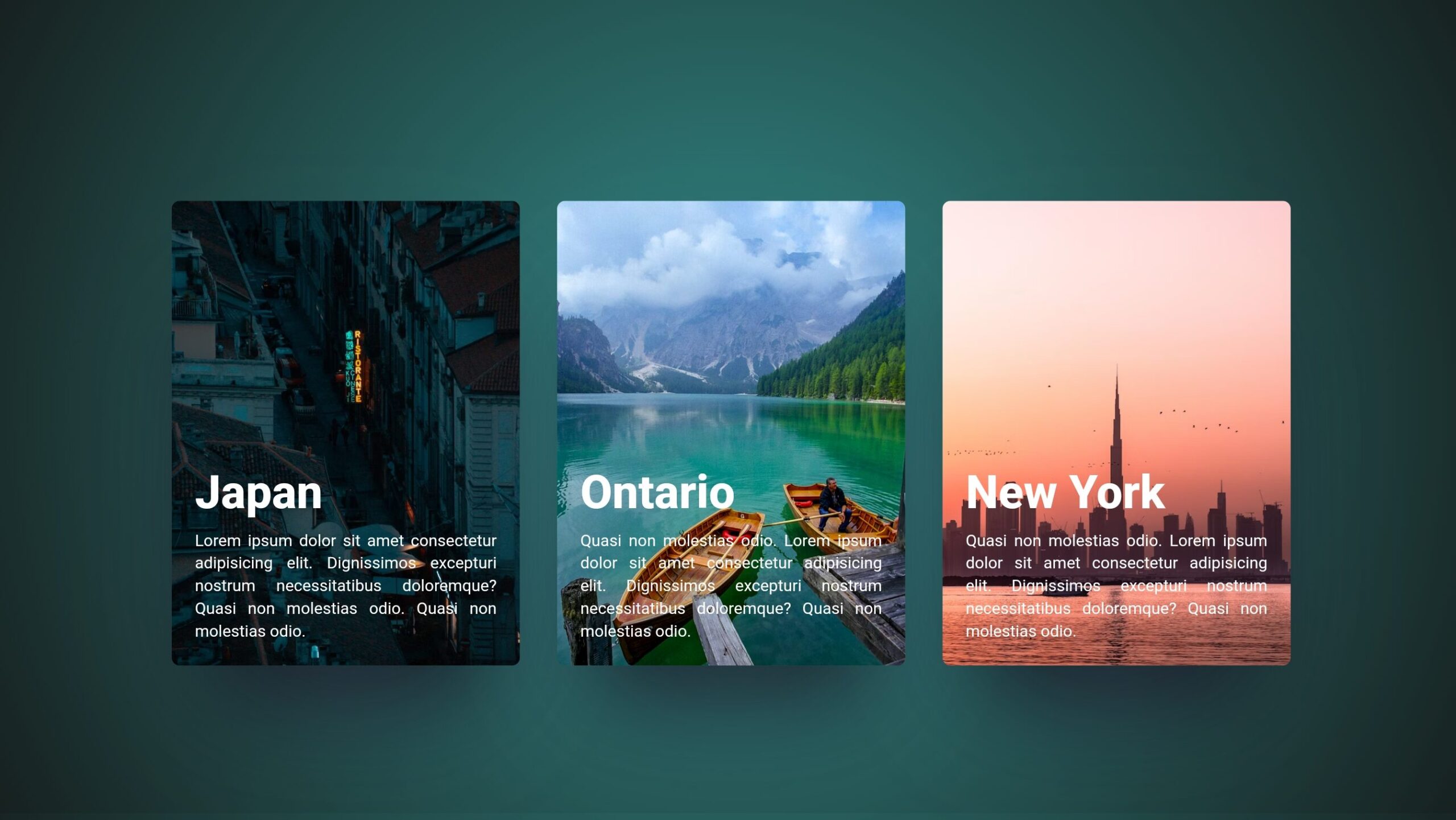
<div class="card" tabindex="0"><img
src="https://images.unsplash.com/photo-1674510891276-bd1fc1a13889?ixlib=rb-4.0.3&ixid=M3wxMjA3fDB8MHxwaG90by1wYWdlfHx8fGVufDB8fHx8fA%3D%3D&auto=format&fit=crop&w=687&q=80"
alt="A City skyline at sunset" />
<div class="text">
<h2 data-splitting="">Japan</h2>
<p data-splitting="">Lorem ipsum dolor sit amet consectetur adipisicing elit. Dignissimos excepturi
nostrum necessitatibus doloremque? Quasi non molestias odio. Quasi non molestias odio.</p>
</div>
</div>
<div class="card" tabindex="0"><img
src="https://images.unsplash.com/photo-1598751337485-0d57b0c50b83?ixlib=rb-4.0.3&ixid=M3wxMjA3fDB8MHxwaG90by1wYWdlfHx8fGVufDB8fHx8fA%3D%3D&auto=format&fit=crop&w=682&q=80"
alt="A City skyline at sunset" />
<div class="text">
<h2 data-splitting="">Ontario</h2>
<p data-splitting=""> Quasi non molestias odio. Lorem ipsum dolor sit amet consectetur adipisicing elit.
Dignissimos excepturi nostrum necessitatibus doloremque? Quasi non molestias odio.</p>
</div>
</div>
<div class="card" tabindex="0"><img
src="https://images.unsplash.com/photo-1612873649383-edf91f1cf7fe?ixlib=rb-4.0.3&ixid=M3wxMjA3fDB8MHxwaG90by1wYWdlfHx8fGVufDB8fHx8fA%3D%3D&auto=format&fit=crop&w=764&q=80"
alt="A City skyline at sunset" />
<div class="text">
<h2 data-splitting="">New York</h2>
<p data-splitting=""> Quasi non molestias odio. Lorem ipsum dolor sit amet consectetur adipisicing elit.
Dignissimos excepturi nostrum necessitatibus doloremque? Quasi non molestias odio.</p>
</div>
</div>
</main>
<script>
//You need to add this line and import JQuery and splittingJs
Splitting();
</script>
</body>
</html>
Step 3: Styling with CSS
Open the style.css file and leverage the provided CSS to bring your image hover effect to life. Experiment with the variables and adjust the colors, shadows, and transitions to suit your design preferences. The CSS code includes key elements like card styling, hover effects, and text animations.
        :root {
            --cover-timing: 0.5s;
            --cover-ease: cubic-bezier(0.66, 0.08, 0.19, 0.97);
            --cover-stagger: 0.15s;
            --text-timing: 0.75s;
            --text-stagger: 0.015s;
            --text-ease: cubic-bezier(0.38, 0.26, 0.05, 1.07);
            --title-stagger: 0.05s;
            --highlight: white;
        }

        body,
        main {
            display: grid;
            place-items: center;
            box-sizing: border-box;
        }

        body,
        html {
            color: white;
            background: rgb(51, 142, 139);
            background: radial-gradient(circle,
                    rgba(51, 142, 139, 1) 0%,
                    rgba(19, 20, 19, 1) 100%);
            padding: 0;
            margin: 0;
            min-height: 100vh;
            font-family: "Open Sans", sans-serif;
        }

        body {
            padding: 1em 0 3em;
            min-height: calc(100vh - 4em);
        }

        .card {
            position: relative;
            overflow: hidden;
            aspect-ratio: 9/12;
            display: flex;
            flex-direction: column;
            border-radius: 7px;
            box-shadow: rgba(255, 255, 255, 0.3) 0 5vw 6vw -8vw,
                rgba(255, 255, 255, 0) 0 4.5vw 5vw -6vw,
                rgba(50, 50, 80, 0.5) 0px 4vw 8vw -2vw, rgba(0, 0, 0, 0.8) 0px 4vw 5vw -3vw;
            transition: box-shadow 1s var(--cover-ease);
        }

        .card>* {
            z-index: 2;
        }

        .card>img {
            z-index: 0;
            transition: all 0.8s cubic-bezier(0.66, 0.08, 0.19, 0.97);
        }

        .card::before,
        .card::after {
            content: "";
            width: 100%;
            height: 50%;
            top: 0;
            left: 0;
            background: rgba(0, 0, 0, 0.5);
            position: absolute;
            transform-origin: left;
            transform: scaleX(0);
            transition: all var(--cover-timing) var(--cover-ease);
            z-index: 1;
        }

        .card::after {
            transition-delay: var(--cover-stagger);
            top: 50%;
        }

        .card:hover,
        .card:focus {
            box-shadow: white 0 5vw 6vw -9vw, var(--highlight) 0 5.5vw 5vw -7.5vw,
                rgba(50, 50, 80, 0.5) 0px 4vw 8vw -2vw, rgba(0, 0, 0, 0.8) 0px 4vw 5vw -3vw;
        }

        .card:hover::before,
        .card:hover::after,
        .card:focus::before,
        .card:focus::after {
            transform: scaleX(1);
        }

        .card:hover h2 .char,
        .card:hover p .word,
        .card:focus h2 .char,
        .card:focus p .word {
            opacity: 1;
            transform: translateY(0);
            color: inherit;
        }

        .card:hover h2 .char,
        .card:focus h2 .char {
            transition-delay: calc(0.1s + var(--char-index) * var(--title-stagger));
        }

        .card:hover p .word,
        .card:focus p .word {
            transition-delay: calc(0.1s + var(--word-index) * var(--text-stagger));
        }

        .card:hover img,
        .card:focus img {
            transform: scale(1.1);
        }

        .card:nth-of-type(1) {
            --highlight: #111518;
        }

        .card:nth-of-type(2) {
            --highlight: #358289;
        }

        .card:nth-of-type(3) {
            --highlight: #dd7360;
        }

        .text {
            position: absolute;
            inset: 20px;
            top: auto;
        }

        h2 {
            font-size: 30px;
            font-size: clamp(20px, 4vw, 40px);
            font-weight: 800;
            margin-bottom: 0.2em;
        }

        p {
            font-size: 12px;
            font-size: clamp(10px, 1.25vw, 14px);
            line-height: 1.4;
            text-align: justify;
            margin-top: 0.2em;
            margin-bottom: 0;
        }

        h2 .char,
        p .word {
            color: var(--highlight);
            display: inline-block;
            opacity: 0;
            position: relative;
            transform: translateY(20px);
            transition-property: transform, opacity, color;
            transition-timing-function: var(--text-ease);
            transition-duration: var(--text-timing), var(--text-timing),
                calc(var(--text-timing) * 2);
        }

        img {
            position: absolute;
            inset: 0;
            width: 100%;
            height: 100%;
            object-fit: cover;
            border-radius: 7px;
        }

        main {
            grid-template-columns: 1fr;
            grid-template-rows: 60px;
            grid-gap: 2em;
        }

        @media screen and (min-width: 600px) {
            main {
                grid-template-columns: 1fr 1fr;
                grid-template-rows: min-content 1fr;
            }
        }

        .card {
            width: 90vw;
            max-width: 300px;
        }

        @media screen and (min-width: 600px) {
            .card {
                width: 40vw;
            }
        }

        h1 {
            color: #efefe9;
            font-weight: 100;
            font-size: 2.4rem;
        }

        @media screen and (min-width: 600px) {
            h1 {
                grid-column: 1/4;
            }
        }
Conclusion:
Congratulations! You’ve successfully set up the project and created the easiest image hover effect using HTML and CSS. This project not only enhances your coding skills but also adds a dynamic touch to your web designs. Feel free to customize and experiment further with the code to make it uniquely yours.
In conclusion, mastering these foundational HTML and CSS skills is a stepping stone for any coding enthusiast. By following these steps and understanding the provided code snippets, you’ve taken a significant stride toward creating interactive and visually appealing web projects. Happy coding!
For your convenience, the total source code of this “Image Hover Effect” project instructional practice is accessible for download by clicking the Download Code button.
Join Our Telegram Channel to Download the Project Source Code: Click Here
Note: Keep in mind that the way to dominate coding is practice. To enhance your skills in JavaScript, HTML & CSS, we recommend recreating other useful website elements such as Custom Button, Reviews Card, Contact Page, Navigation, Login Forms, etc.
More Categories:
Blog • Cards • Fun Project • Game • Hamburger Menu • Login / Signup • Navbar • Testimony / Reviews • To-Do List


