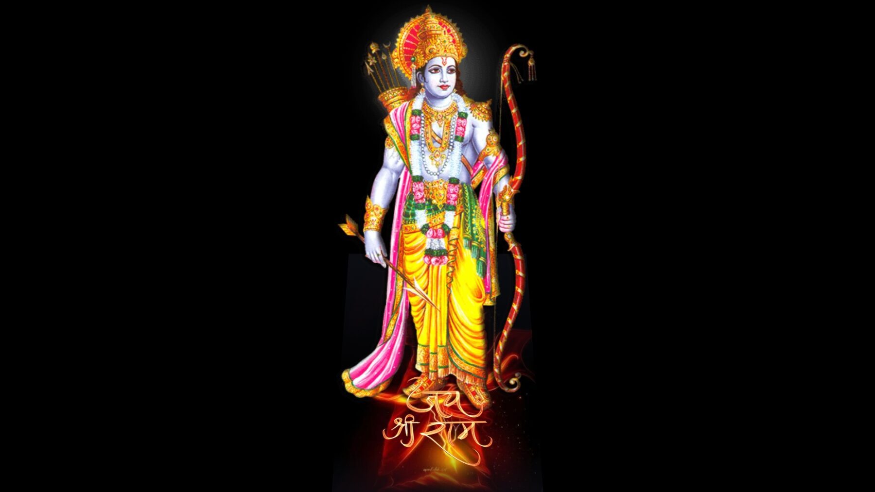
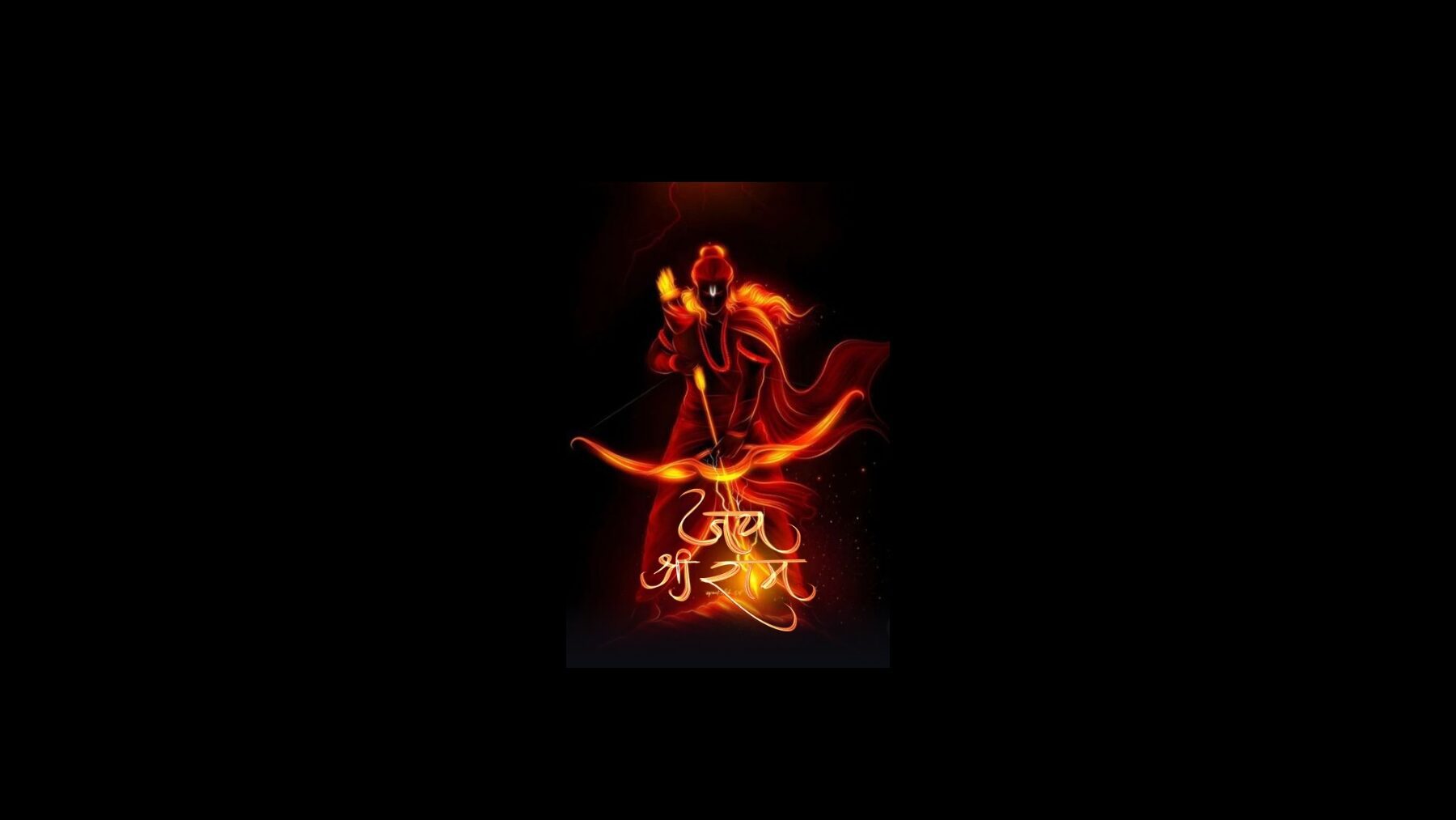

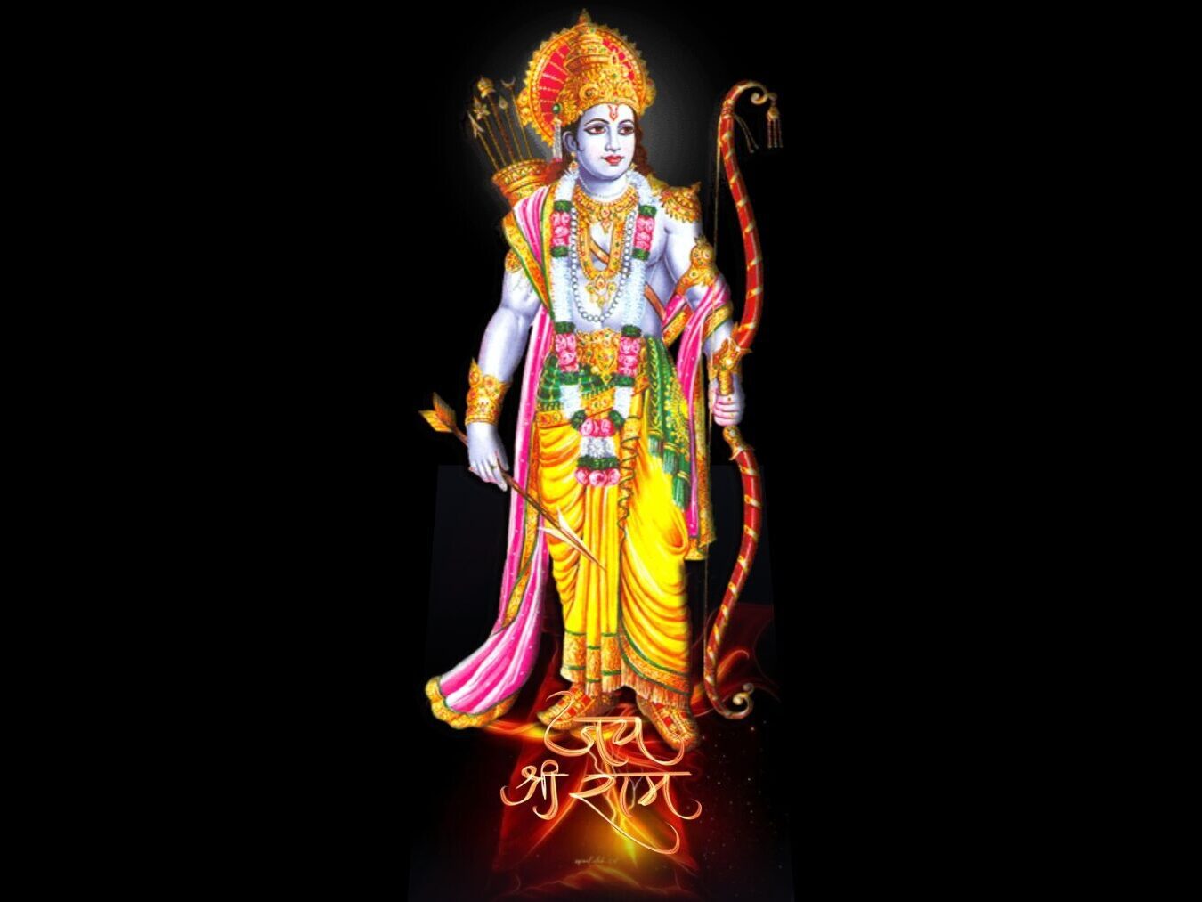

Step into the realm of web enchantment with our comprehensive guide on crafting a mesmerizing “Jai Shree Ram card effect” using HTML and CSS. In this tutorial, we’ll unravel the intricacies of web development to fashion a card that not only showcases divine imagery but also incorporates a captivating hover effect.
Embark on this coding expedition as we explore each step in detail, from establishing the fundamental HTML structure to infusing life into the card with CSS styling. Whether you’re a coding aficionado or just venturing into the world of web design, this tutorial promises to demystify the creation of the “Jai Shree Ram card effect.”
Let the divine essence of this project inspire your coding journey as we delve into the nuances of positioning, transitions, and creative design elements. Without further ado, let’s commence the journey of bringing the sacred “Jai Shree Ram card effect” to life on your website.
Join Our Telegram Channel to Download the Project Source Code: Click Here
Steps to Set Up the Jai Shree Ram Card Effect:
Please follow this Step-by-Step Guide to Create and Setup the trendy Jai Shree Ram card effect using HTML and CSS —
Begin by creating a dedicated folder for your project. Inside this folder, include the provided HTML code in an index.html file and the accompanying CSS styling in a style.css file. Additionally, download the necessary images and place them in the project directory.
Step 1: HTML Markup
Open the index.html file and insert the provided HTML code. This includes essential tags like <html>, <head>, and <body>, along with the structured elements for our card: <div>, <img>, and more.
<!DOCTYPE html>
<html lang="en">
<head>
    <meta charset="UTF-8">
    <meta name="viewport" content="width=device-width, initial-scale=1.0">
    <title>jai shree ram card effect </title>
</head>
<body>
    <div class="card">
        <div class="wrapper">
            <img src="https://i.pinimg.com/564x/96/3c/bf/963cbf83c60218edfeb3b4f436d64643.jpg" class="cover-image" />
        </div>
        <img src="https://res.cloudinary.com/freecodez/image/upload/v1698112176/images/qmdfgphh69jhwkjjgbsm.webp" class="title" />
        <img src="https://www.godpng.com/uploads/png/shree-ram-photo-png.png" class="character" />
    </div>
</body>
</html>
Step 2: CSS Styling
Open the style.css file and explore the included styling. This CSS defines the card’s dimensions, hover effects, and the transformative animations that bring the “Jai Shree Ram card effect” to life. Don’t hesitate to experiment with colors, shadows, and other properties to customize the card to your liking.
        :root {
            --card-height: 300px;
            --card-width: 200px;
        }

        * {
            box-sizing: border-box;
        }

        body {
            width: 100vw;
            height: 100vh;
            margin: 0;
            display: flex;
            justify-content: center;
            align-items: center;
            background: black;
        }

        .card {
            width: var(--card-width);
            height: var(--card-height);
            position: relative;
            display: flex;
            justify-content: center;
            align-items: flex-end;
            padding: 0 36px;
            perspective: 2500px;
            margin: 0 50px;
            cursor: pointer;
        }

        .cover-image {
            width: 100%;
            height: 100%;
            object-fit: cover;
        }

        .wrapper {
            transition: all 0.5s;
            position: absolute;
            width: 100%;
            height: 100%;
            z-index: -1;
        }

        .card:hover .wrapper {
            transform: perspective(900px) translateY(-5%) rotateX(25deg) translateZ(0);
            box-shadow: 2px 35px 32px -8px rgba(0, 0, 0, 0.75);
            -webkit-box-shadow: 2px 35px 32px -8px rgba(0, 0, 0, 0.75);
            -moz-box-shadow: 2px 35px 32px -8px rgba(0, 0, 0, 0.75);
        }

        .wrapper::before,
        .wrapper::after {
            content: "";
            opacity: 0;
            width: 100%;
            height: 80px;
            transition: all 0.5s;
            position: absolute;
            left: 0;
        }

        .wrapper::before {
            top: 0;
            height: 100%;
            background-image: linear-gradient(to top,
                    transparent 46%,
                    rgba(12, 13, 19, 0.5) 68%,
                    rgba(12, 13, 19) 97%);
        }

        .wrapper::after {
            bottom: 0;
            opacity: 1;
            background-image: linear-gradient(to bottom,
                    transparent 46%,
                    rgba(12, 13, 19, 0.5) 68%,
                    rgba(12, 13, 19) 97%);
        }

        .card:hover .wrapper::before,
        .wrapper::after {
            opacity: 1;
        }

        .card:hover .wrapper::after {
            height: 120px;
        }

        .title {
            width: 100%;
            transition: transform 0.5s;
        }

        .card:hover .title {
            transform: translate3d(0%, -50px, 100px);
        }

        .character {
            width: 100%;
            opacity: 0;
            transition: all 0.5s;
            position: absolute;
            z-index: -1;
        }

        .card:hover .character {
            opacity: 1;
            transform: translate3d(0%, -30%, 100px);
        }
Conclusion:
In conclusion, you’ve successfully embarked on a creative journey to implement the “Jai Shree Ram card effect” on your website. This project serves as an excellent opportunity for coding enthusiasts to reinforce their HTML and CSS skills. As you hover over the card, witness the subtle yet impactful animations that elevate your web design.
By following these steps, you’ve not only created a visually appealing card but also gained insights into responsive design and transformative CSS effects. The “Jai Shree Ram card effect” is more than just a project; it’s an expression of your coding prowess. May your coding journey be as divine and fulfilling as the effect you’ve just brought to life. Jai Shree Ram!
For your convenience, the total source code of this “Jai Shree Ram card effect” project instructional practice is accessible for download by clicking the Download Code button.
Join Our Telegram Channel to Download the Project Source Code: Click Here
Note: Keep in mind that the way to dominate coding is practice. To enhance your skills in JavaScript, HTML & CSS, we recommend recreating other useful website elements such as Custom Button, Reviews Card, Contact Page, Navigation, Login Forms, etc.
More Categories:
Blog • Cards • Fun Project • Game • Hamburger Menu • Login / Signup • Navbar • Testimony / Reviews • To-Do List


