

Table of Contents
Introduction:
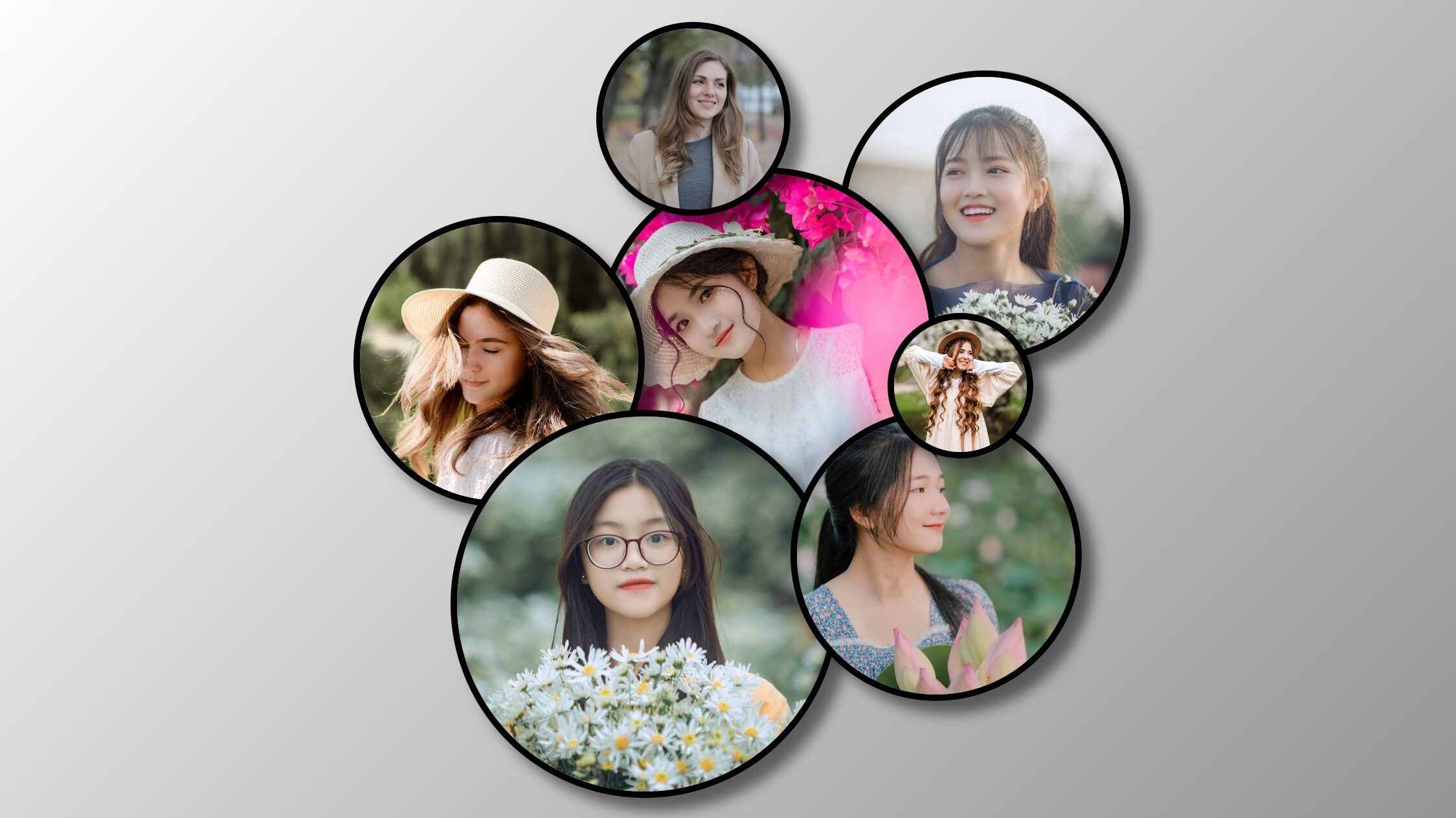
In the digital realm, the power of visual storytelling is unparalleled, and crafting engaging photo collage is a gateway to enhancing online experiences. This tutorial guides you through the creation of captivating photo collage with hover effects, offering a dynamic and interactive showcase for your images. Whether you’re a photographer aiming to display a portfolio or a developer seeking to elevate website aesthetics, mastering this blend of HTML and CSS will empower you to leave a lasting impact on your audience.
Unlock the potential of visual expression by exploring the art of photo collages. Learn to seamlessly integrate hover effects that breathe life into your images, creating an immersive and memorable user experience. With step-by-step instructions, this guide empowers you to not only build photo collage but also infuse them with interactivity, opening doors to endless possibilities for creative expression in the digital landscape.
Join Our Telegram Channel to Download the Project Source Code: Click Here
Steps to Create : Photo Collage with Hover Effect using HTML and CSS
Please follow this Step-by-Step Guide to Create and Setup the process of designing a stunning photo collage with hover effects using HTML and CSS —
Start by creating a new folder and naming it according to your preference. Inside this folder, create two files: index.html and style.css. These files will contain the HTML structure and CSS styling for our photo collage respectively.
Step 1: Understanding HTML Structure
The index.html file serves as the foundation of our photo collage. Let’s break down the key components:
- We begin with the
<!DOCTYPE html>declaration followed by the opening<html>tag. - Inside the
<head>section, we include meta tags for character set and viewport settings, along with a title for our document. - The
<style>section within the head contains our CSS code for styling the collage. - Moving to the
<body>section, we have two main<div>containers with the classescontainer collage1andcontainer collage2. These containers hold the grid structure for our photo collage.
<!DOCTYPE html>
<html lang="en">
<head>
    <meta charset="UTF-8">
    <meta name="viewport" content="width=device-width, initial-scale=1.0">
    <title>Photo Collages</title>
</head>

<body>
<div class="container collage1">
  <div class="grid-container">
    <div class="item item1">
      <img src="https://images.pexels.com/photos/3776446/pexels-photo-3776446.jpeg?auto=compress&cs=tinysrgb&w=1260&h=750&dpr=1" alt="image">
    </div>
    <div class="item item2">
      <img src="https://images.pexels.com/photos/13780817/pexels-photo-13780817.jpeg?auto=compress&cs=tinysrgb&w=1260&h=750&dpr=1" alt="image">
    </div>
    <div class="item item3">
      <img src="https://images.pexels.com/photos/1382728/pexels-photo-1382728.jpeg?auto=compress&cs=tinysrgb&w=1260&h=750&dpr=1" alt="image">
    </div>
    <div class="item item4">
      <img src="https://images.pexels.com/photos/3251131/pexels-photo-3251131.jpeg?auto=compress&cs=tinysrgb&w=600&lazy=load" alt="image">
    </div>
    <div class="item item5">
      <img src="https://images.pexels.com/photos/12105771/pexels-photo-12105771.jpeg?auto=compress&cs=tinysrgb&w=1260&h=750&dpr=1" alt="image">
    </div>
    <div class="item item6">
      <img src="https://images.pexels.com/photos/3303058/pexels-photo-3303058.jpeg?auto=compress&cs=tinysrgb&w=600&lazy=load" alt="image">
    </div>
    <div class="item item7">
      <img src="https://images.pexels.com/photos/7571269/pexels-photo-7571269.jpeg?auto=compress&cs=tinysrgb&w=1260&h=750&dpr=1" alt="image">
    </div>
  </div>
</div>

<div class="container collage2">
  <div class="grid-container">
    <div class="item item1">
      <img src="https://images.pexels.com/photos/3776446/pexels-photo-3776446.jpeg?auto=compress&cs=tinysrgb&w=1260&h=750&dpr=1" alt="image">
    </div>
    <div class="item item2">
      <img src="https://images.pexels.com/photos/13780817/pexels-photo-13780817.jpeg?auto=compress&cs=tinysrgb&w=1260&h=750&dpr=1" alt="image">
    </div>
    <div class="item item3">
      <img src="https://images.pexels.com/photos/1382728/pexels-photo-1382728.jpeg?auto=compress&cs=tinysrgb&w=1260&h=750&dpr=1" alt="image">
    </div>
    <div class="item item4">
      <img src="https://images.pexels.com/photos/3251131/pexels-photo-3251131.jpeg?auto=compress&cs=tinysrgb&w=600&lazy=load" alt="image">
    </div>
    <div class="item item5">
      <img src="https://images.pexels.com/photos/12105771/pexels-photo-12105771.jpeg?auto=compress&cs=tinysrgb&w=1260&h=750&dpr=1" alt="image">
    </div>
    <div class="item item6">
      <img src="https://images.pexels.com/photos/3303058/pexels-photo-3303058.jpeg?auto=compress&cs=tinysrgb&w=600&lazy=load" alt="image">
    </div>
    <div class="item item7">
      <img src="https://images.pexels.com/photos/7571269/pexels-photo-7571269.jpeg?auto=compress&cs=tinysrgb&w=1260&h=750&dpr=1" alt="image">
    </div>
  </div>
</div>
</body>
</html>
Step 2: Exploring CSS Styling
Now, let’s delve into the CSS code (style.css) that brings our photo collage to life:
- We begin with the universal selector
*, applying box-sizing and resetting margin and padding to zero for consistency. - Images (
img) within the collage are set to cover their respective containers using object-fit property. - The
.containerclass ensures our collage remains centered on the page, while.grid-containerdefines the grid layout. - Each
.itemrepresents an individual photo within the collage, styled with a circular border and box-shadow for a polished look. - Hover effects are achieved using CSS transitions and scaling properties, enhancing user interaction with the collage.
* {
  box-sizing: border-box;
  margin: 0px;
  padding: 0px;
}

img {
  width: 100%;
  height: 100%;
  -o-object-fit: cover;
     object-fit: cover;
}

.container {
  display: flex;
  justify-content: center;
  align-items: center;
  width: 100%;
  padding: 20px 20px;
}

.grid-container {
  margin: auto;
  max-width: 600px;
  aspect-ratio: 1/1;
  display: grid;
  grid-template-columns: repeat(16, 1fr);
  grid-template-rows: repeat(16, 1fr);
}

.collage1 {
  background: linear-gradient(135deg, rgb(249, 110, 151) 0%, rgb(144, 0, 62) 100%);
}
.collage1 .item {
  border: 5px solid white;
}

.collage2 {
  background: linear-gradient(135deg, rgb(255, 255, 255) 0%, rgb(145, 145, 145) 100%);
}
.collage2 .item {
  border: 5px solid black;
}

.item {
  border-radius: 50%;
  overflow: hidden;
  box-shadow: rgba(0, 0, 0, 0.5) 10px 10px 10px 0px;
}

.item1 {
  z-index: 10;
  grid-area: 1/6/5/10;
}
.item2 {
  z-index: 6;
  grid-area: 5/1/11/7;
}
.item3 {
  z-index: 5;
  grid-area: 4/6/11/13;
}
.item4 {
  grid-area: 2/-1/8/-7;
}
.item5 {
  z-index: 10;
  grid-area: 7/-3/10/-6;
}
.item6 {
  z-index: 6;
  grid-area: -1/3/-9/11;
}
.item7 {
  z-index: 6;
  grid-area: -3/-2/-9/-8;
}

.grid-container > * {
  transition: all 0.5s;
}
.grid-container > *:hover {
  z-index: 99;
  transform: scale(1.3);
}
Conclusion:
In conclusion, by following this tutorial, you’ve learned how to create a visually appealing photo collage with hover effects using HTML and CSS. Whether you’re showcasing your photography portfolio or sprucing up your website, incorporating photo collage adds an engaging element to your online presence. Experiment with different images, layouts, and hover effects to personalize your collage and make it truly unique.
Remember, practice makes perfect, so don’t hesitate to experiment and refine your photo collage to suit your specific needs and preferences. Happy coding, and may your photo collage captivate audiences far and wide!
Join Our Telegram Channel to Download the Project Source Code: Click Here
For your convenience, the total source code of this “login and signup form” project instructional practice is accessible for download by clicking the Download Code button.
Note: Keep in mind that the way to dominate coding is practice. To enhance your skills in JavaScript, HTML & CSS, we recommend recreating other useful website elements such as Custom Button, Reviews Card, Contact Page, Navigation, Login Forms, etc.
More Categories:
Blog • Cards • Fun Project • Game • Hamburger Menu • Login / Signup • Navbar • Testimony / Reviews • To-Do List


