
Welcome to the definitive guide for crafting an impressive Responsive About Page using HTML and CSS! In this tutorial, we’ll embark on a journey through the intricacies of web development, focusing on HTML and CSS to create a page that adapts seamlessly to various devices. As we explore the steps together, you’ll witness the power of responsive design, enhancing user experience and accessibility.
Join me in unraveling the art of building a Responsive About Page, a fundamental component for anyone venturing into web development. Whether you’re a coding enthusiast or a novice, this tutorial provides clear instructions to set up and customize an about page that dynamically responds to different screen sizes.
Let’s dive into the steps and elevate your web development skills by creating a visually appealing and responsive about page using HTML and CSS.
Join Our Telegram Channel to Download the Project Source Code: Click Here
Steps to Create Responsive About Page:
Please follow this Step-by-Step Guide to Create and Setup the Responsive About Page using HTML and CSS —
1. Setting Up Your Project:
- Begin by creating a new folder for your project.
- Inside, establish two key files:
index.htmlfor the main content andstyle.cssfor styling. - Download the provided images folder and place it within your project directory.
2. HTML Structure:
- Open
index.htmland start with the basic HTML structure. - Utilize semantic tags like
<html>,<head>,<body>, and<section>to structure your page. - Incorporate the given HTML code, ensuring you understand the role of each element.
<!DOCTYPE html>
<html lang="en">
<head>
<meta charset="UTF-8">
<meta name="viewport" content="width=device-width, initial-scale=1.0">
<title>About me page</title>
</head>
<body>
<section class="hero">
<div>
<h1>Robbie Lens Photography</h1>
<p>Where professionalism meets passion. For over 5 years now, I have been practicing my profession with the
passion that drives me: capturing the essence of every moment.</p>
<a class="cta" href="">CONTACT ME</a>
</div>
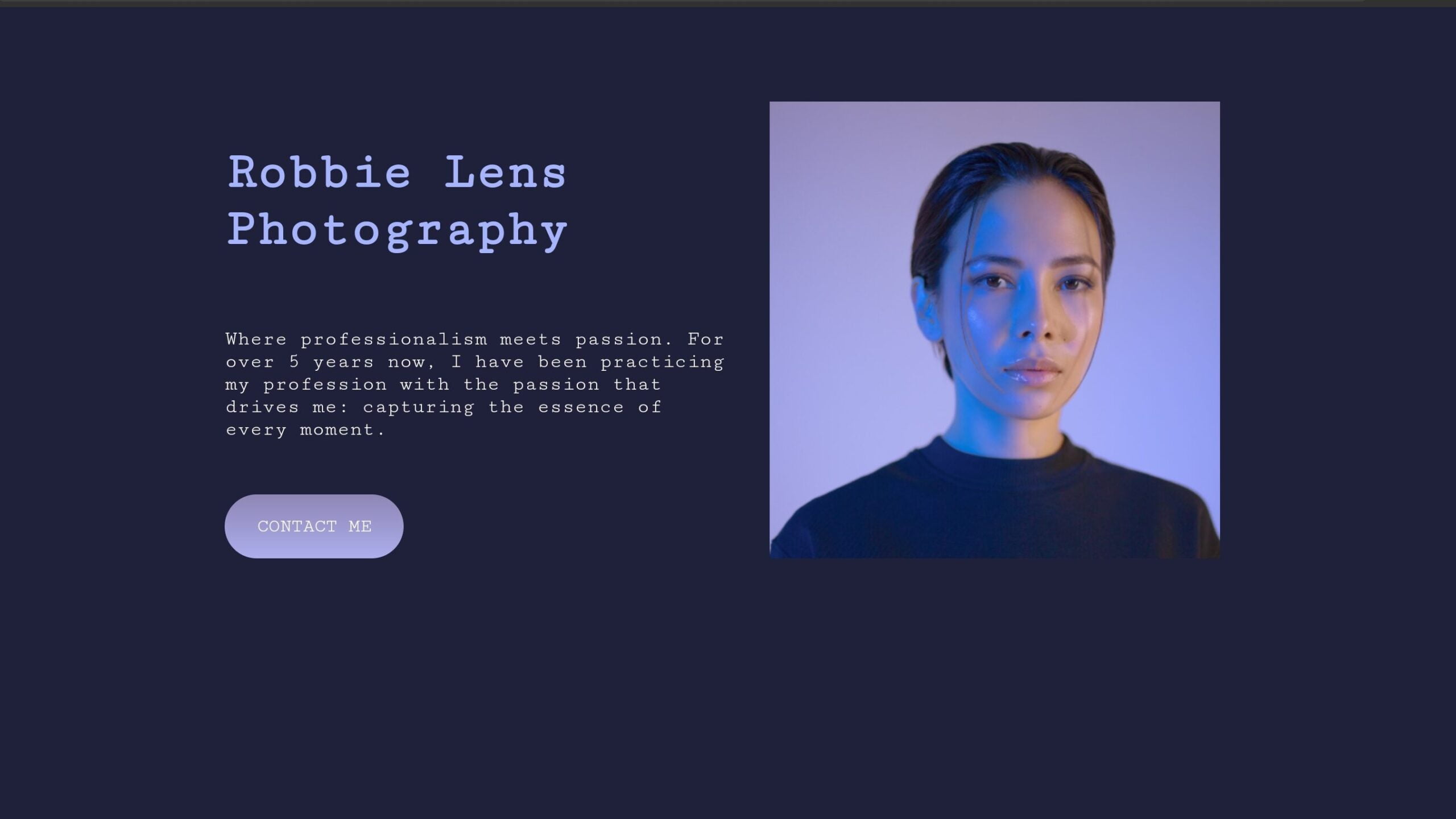
<img src="https://silkroad007.github.io/Images/robbie-lens.png" alt="">
</section>
</body>
</html>
3. Styling with CSS:
- Open
style.cssand begin styling to achieve responsiveness. - Explore the provided CSS code, emphasizing the use of flexbox and media queries for adaptability.
- Experiment with various properties to customize the color scheme, fonts, and overall aesthetics.
        html {
            font-size: 16px;
        }

        body {
            background-color: #1F2039;
            font-family: 'Courier New', Courier, monospace;
        }

        section {
            padding: 80px;
        }

        .hero {
            display: flex;
            flex-direction: row;
            width: 65%;
            margin: auto;
        }

        div {
            margin-right: 40px;
            padding-top: 0;
        }

        h1 {
            color: #A5B4FC;
            font-size: 3em;
            padding-bottom: 25px;
        }

        p {
            color: white;
            font-size: 1.2em;
            margin-bottom: 70px;
        }

        a {
            text-decoration: none;
            color: white;
        }

        a:hover {
            text-decoration: none;
        }

        .cta {
            color: white;
            background: linear-gradient(#8E86B5, #ACAEED);
            padding: 20px 30px;
            font-size: 1.1em;
            border-radius: 50px;
        }

        .cta:hover {
            text-decoration: none;
            background: linear-gradient(#696484, #8788BA);
        }

        @media screen and (max-width: 996px) {
            .hero {
                flex-direction: column;
                text-align: center;
                justify-content: center;
                padding: 30px;
                padding: 10px;
                width: 85%;
            }

            .hero img {
                order: 1;
                margin-bottom: 40px;
            }

            .hero div {
                order: 2;
                height: auto;
                margin-bottom: 15px;
                margin-right: 0;
            }

            .home p {
                padding: 0 50px 0 50px;
                margin-bottom: 50px;
            }
        }

        @media screen and (max-width: 470px) {
            .hero h1 {
                font-size: 2em;
            }

            .hero p {
                font-size: 1.2em;
            }
        }
Conclusion:
In conclusion, the journey to creating a responsive about page involves mastering the synergy between HTML and CSS. The provided code serves as a foundation, allowing you to showcase your identity or brand effectively. As you follow these three steps, immerse yourself in the code, tweaking it to align with your unique style and preferences.
Remember, responsiveness is key in today’s dynamic digital landscape. By incorporating media queries and flexible layouts, your about page will seamlessly adapt to diverse devices. The amalgamation of structured HTML and artistic CSS unveils a visually appealing and user-friendly about page.
Feel free to iterate on the provided code, adding personal touches and expanding your project’s features. As you navigate this tutorial, may your coding journey be both enlightening and gratifying.
For your convenience, the total source code of this “Text Shadow Generator using JavaScript” project instructional practice is accessible for download by clicking the Download Code button.
Join Our Telegram Channel to Download the Project Source Code: Click Here
Note: Keep in mind that the way to dominate coding is practice. To enhance your skills in JavaScript, HTML & CSS, we recommend recreating other useful website elements such as Custom Button, Reviews Card, Contact Page, Navigation, Login Forms, etc.
More Categories:
Blog • Cards • Fun Project • Game • Hamburger Menu • Login / Signup • Navbar • Testimony / Reviews • To-Do List


